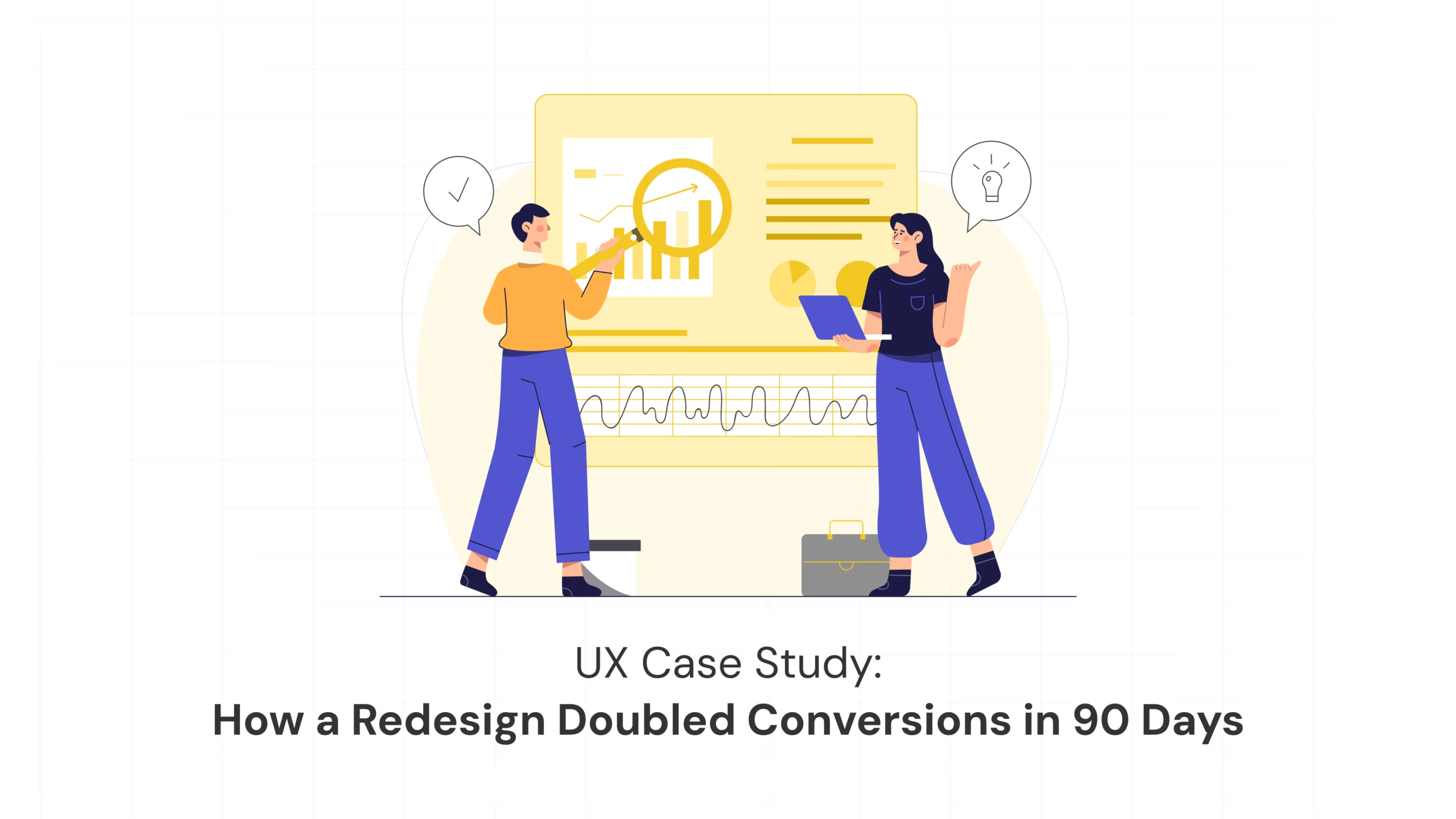
Sometimes growth doesn’t come from adding more features or launching louder campaigns. It comes from clarity. This is the story of how a fast-growing digital brand came to us feeling stuck and uncertain — and left with an experience their users finally loved using. No buzzwords, no shortcuts, just thoughtful, human-first design.
How a Simple UX Redesign Helped a Growing Brand Double Its Conversions in 90 Days
- January 12, 2026
- Kaavya Shree S
- 10:00 am
Post Views: 193
A Real-World Design Story by Kavinu Design
Sometimes growth doesn’t come from adding more features or launching louder campaigns. It comes from clarity. This is the story of how a fast-growing digital brand came to us feeling stuck and uncertain — and left with an experience their users finally loved using. No buzzwords, no shortcuts, just thoughtful, human-first design.
The Situation: “People Love Our Product, But They’re Not Using It”
Our client was a fast-scaling consumer brand with a strong social presence and increasing website traffic. On paper, everything looked promising. Their brand awareness was growing, customer reviews were positive, and their marketing efforts were driving consistent traffic.
But conversions were flat.
Users were landing on the website, scrolling through pages, getting confused, and quietly leaving. The product itself wasn’t the problem. The experience around it was. The brand had built something people wanted — but the website wasn’t helping them understand how to move forward.
This is where modern brand experience design becomes the real differentiator.
Listening Before Designing
Before opening design tools or sketching new layouts, we started by listening. We studied how users moved through the website, analysed drop-off points, reviewed feedback, and observed real user behaviour.
What we discovered was simple but powerful. Users trusted the brand and liked the product, but they didn’t know what to do next. The website presented too many choices, too many messages, and too many distractions at once. Instead of guiding users, it overwhelmed them.
This insight became the foundation of our design process.
Designing for Human Decisions, Not Clicks
Instead of redesigning everything, we redesigned the journey. We focused on three simple questions every user subconsciously asks: What am I looking at? Why should I care? And what should I do next?
From there, we simplified the entire flow. Navigation became clearer, content became more focused, calls-to-action became calmer and more confident, and the user journey became predictable and reassuring. We removed elements that created friction and strengthened those that built trust.
This is the essence of emotion-led design — designing not just for interaction, but for understanding.
Turning the Interface into a Guide
We treated the interface like a friendly guide rather than a salesperson. Instead of aggressive prompts and pressure-driven messaging, we shifted the tone toward clarity and reassurance. The experience began to say, “Here’s how it works,” “Here’s why it helps,” and “Take a look when you’re ready.”
Layouts were redesigned to breathe. Visual hierarchy was improved. Forms were simplified. Checkout friction was removed. The experience finally felt calm and easy to move through.
That’s when design stops being decoration and becomes true digital experience strategy.
The Results After 90 Days
Once the redesigned experience went live, the impact was immediate. Within 90 days, the brand saw a two-times increase in conversions, a 38% reduction in bounce rate, and a 47% increase in average session time. More importantly, users were no longer hesitating. They were moving forward with confidence.
People weren’t just staying longer on the site — they were finally understanding it.
What the Client Told Us
The client told us, “The product always worked. But now, it finally feels easy. Our customers understand us better — and we understand them better too.”
That’s the power of thoughtful UX.
What This Case Teaches Every Growing Brand
This story isn’t about a lucky redesign. It’s about mindset. Growth doesn’t come from louder marketing. It comes from better understanding. It comes from respecting attention, simplifying decisions, and guiding users instead of pushing them.
When design feels human, people respond.
How Kavinu Designs for Real People
At Kavinu Design, we design with empathy, build with intention, and simplify with confidence. Every experience we create begins with understanding real people — their needs, their doubts, and their expectations. We don’t believe in adding complexity for the sake of aesthetics. Instead, we focus on clarity, purpose, and emotional ease, so that every interface feels natural to use and effortless to navigate.
We believe every interface is a conversation between a brand and a human being. And every conversation should feel respectful, supportive, and clear.
Explore more insights on the Kavinu Blog.
Final Thought: Growth Follows Clarity
When users understand you, they trust you. When they trust you, they stay. And when they stay, your business grows.
Design doesn’t just make things look better. It makes things work better. And that’s where real success begins.
CTA: Ready to Transform Your Digital Experience?
If your website or product feels confusing, heavy, or difficult — your users feel it too.
At Kavinu Design, we help brands remove friction, build trust, and create experiences people genuinely enjoy using.
- Discover how we work: Our Design Process
- Explore our insights: Kavinu Blog
- Or start a conversation with us today.
Because growth begins with clarity.
Latest Blogs
-
The AI Revolution in UI/UX Design: How Data-Driven Intelligence Is Reshaping Human Experiences30 Jan 2026
-
Designing for the First 10 Seconds: How Brands Win or Lose Users Instantly in 202621 Jan 2026
-
The Quiet Power of Design: Why the Best Digital Products in 2026 Feel Effortless16 Jan 2026
-
How a Simple UX Redesign Helped a Growing Brand Double Its Conversions in 90 Days12 Jan 2026
-
Why Great UI and UX Design in 2026 Feels Less Like Technology and More Like a Conversation08 Jan 2026
Work With Us to Create Impactful Digital Experiences
FAQ
Why do many websites fail to convert despite high traffic?
Because traffic alone doesn’t create growth. If users feel confused, overwhelmed, or unsure about what to do next, they leave — even if they like the product.
How does UX design directly impact conversions?
UX design reduces friction, clarifies decision paths, and builds trust. When users feel confident and supported, they are far more likely to convert.
How does Kavinu approach UX redesign projects?
Kavinu starts with user behaviour analysis, journey mapping, and emotional insights before designing interfaces that feel intuitive, calm, and purposeful.