January 21, 2026
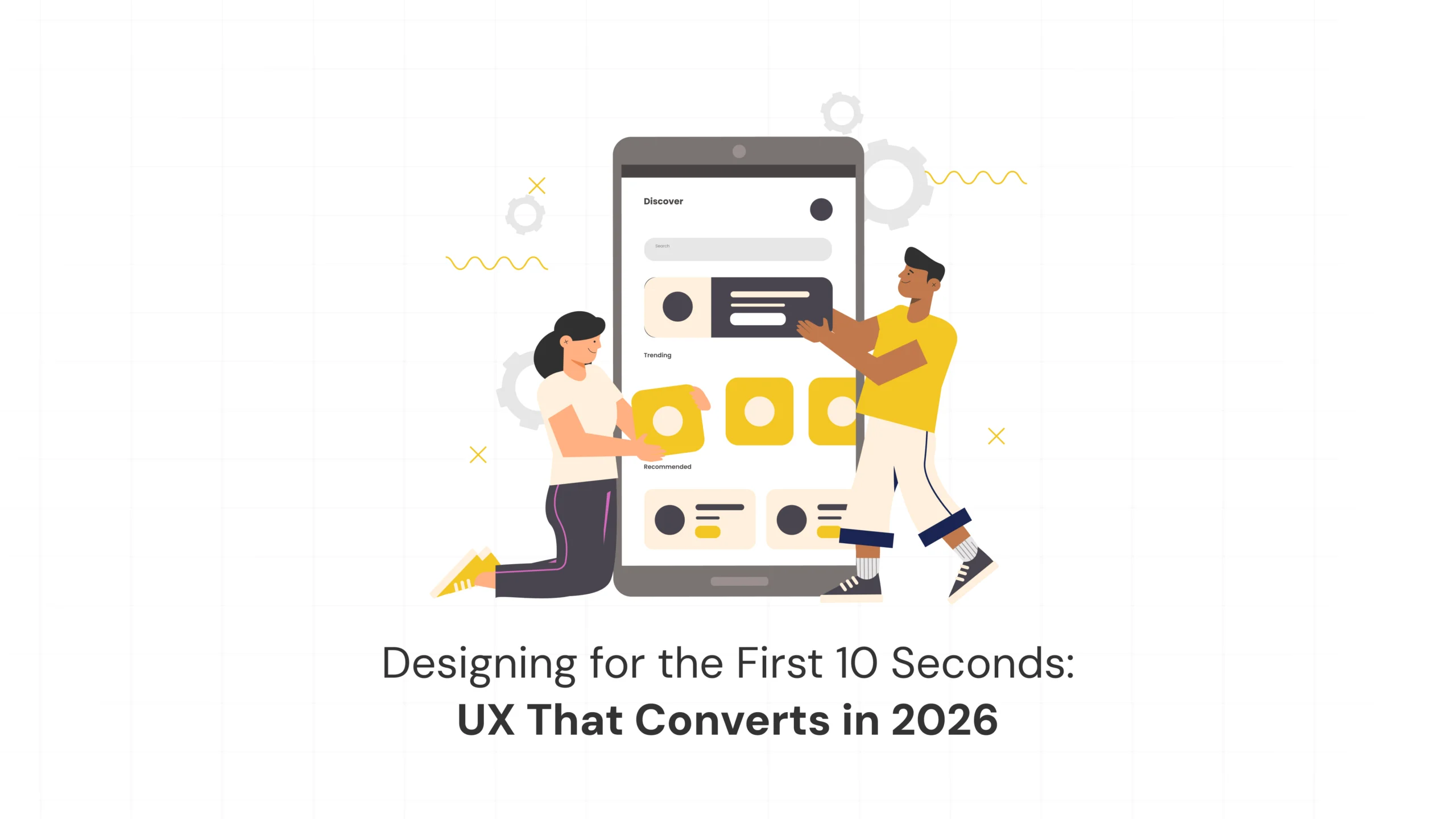
In 2026, the most important moment in any digital experience happens before users read your headline, explore your features, or...

In 2026, the most important moment in any digital experience happens before users read your headline, explore your features, or...
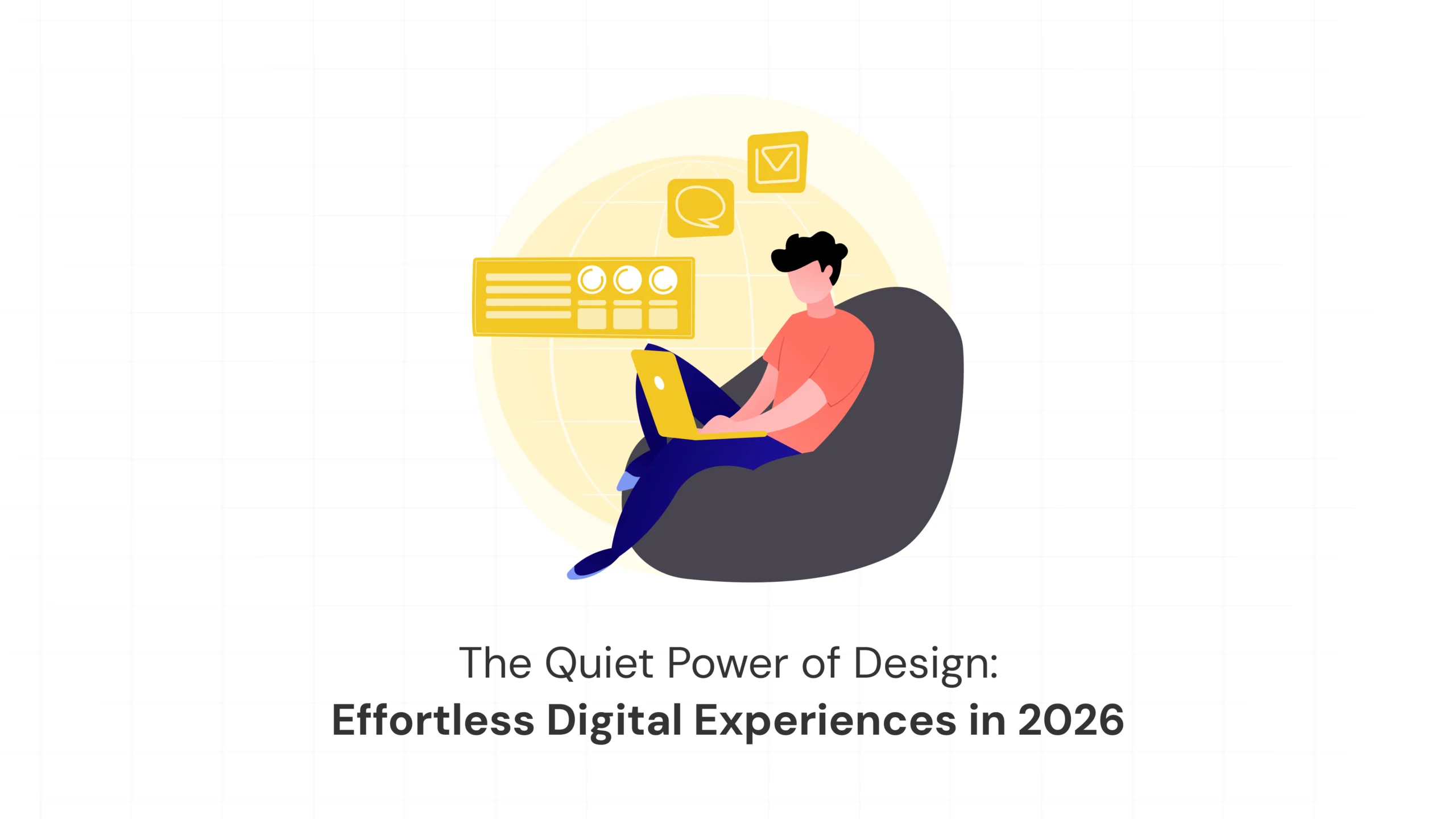
There’s a moment we’ve all experienced. You open a website. You find what you need without searching too hard. You finish what you...
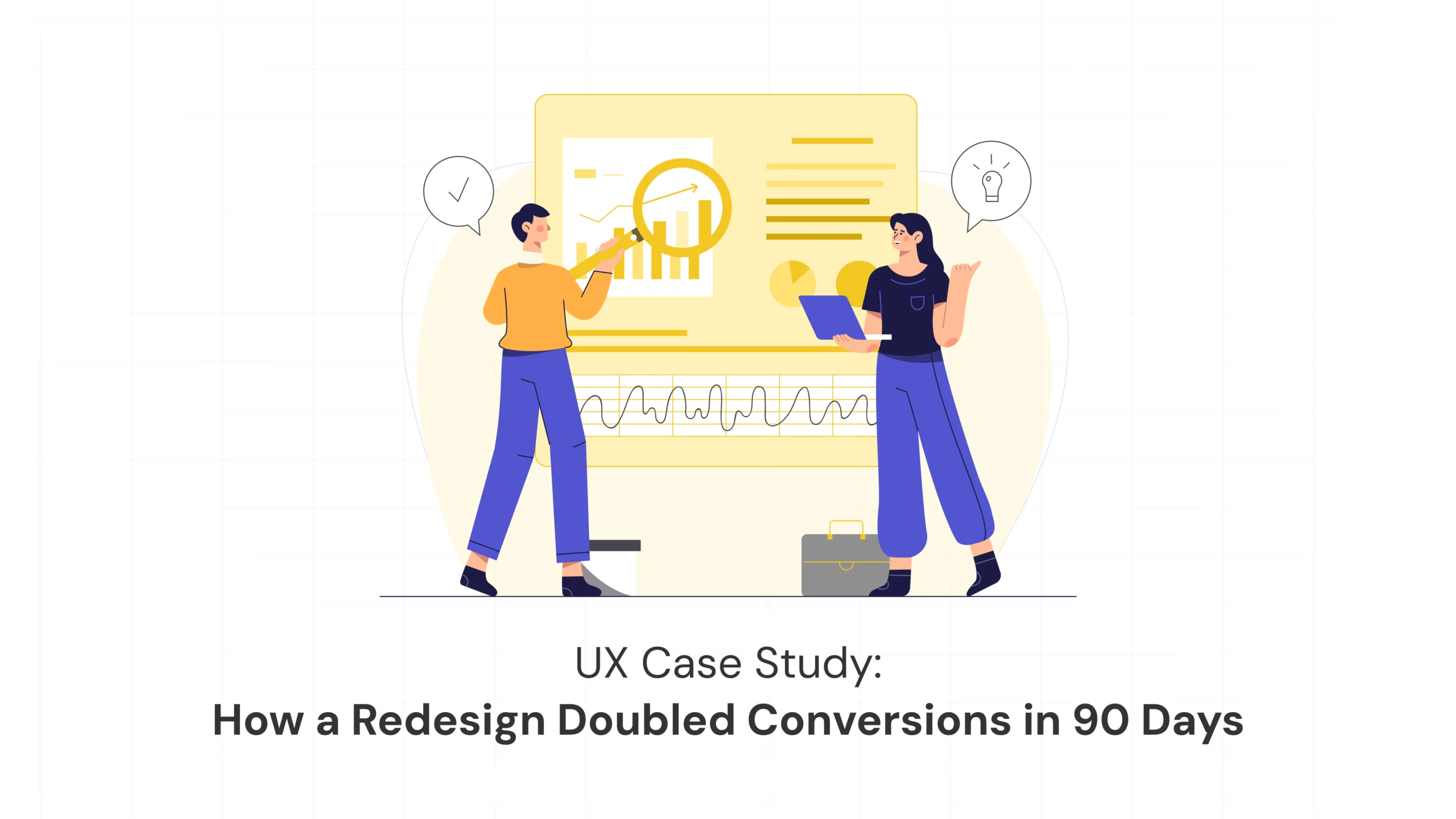
Sometimes growth doesn’t come from adding more features or launching louder campaigns. It comes from clarity. This is the story of how...