Imagine deleting an important project with a single click. No warning, no confirmation, and no chance to change your mind.
The action was fast, but the experience wasn’t necessarily good.
For years, UX design has focused on reducing friction: fewer clicks, shorter forms, and faster journeys. While this makes sense for many interactions, should every action be as fast as possible?
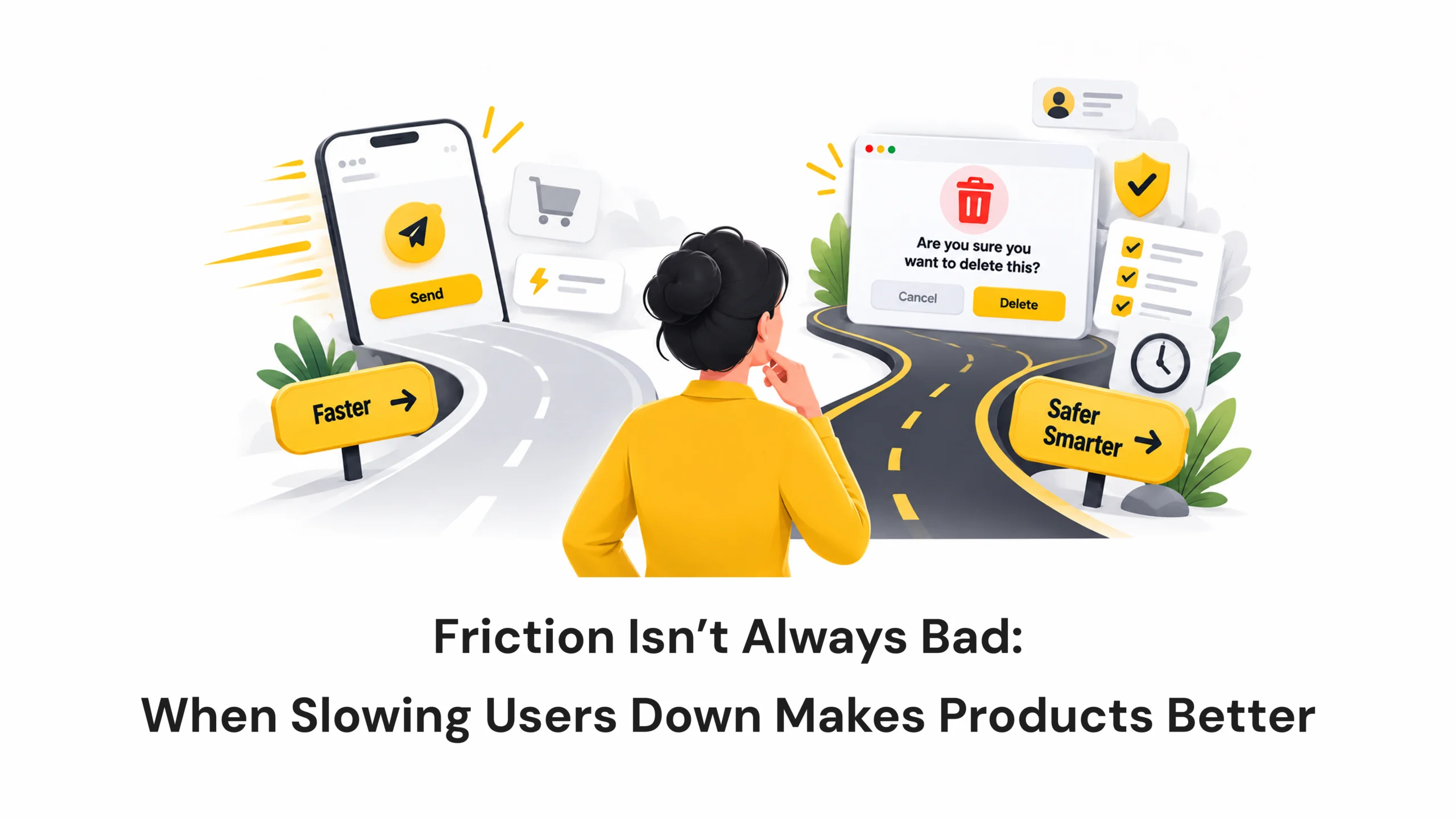
Friction Isn’t Always Bad: When Slowing Users Down Makes Products Better
- October 15, 2026
- Pavithra R
- 10:00 am
Views: 23
Imagine deleting an important project with a single click. No warning, no confirmation, and no chance to change your mind.
The action was fast, but the experience wasn’t necessarily good.
For years, UX design has focused on reducing friction: fewer clicks, shorter forms, and faster journeys. While this makes sense for many interactions, should every action be as fast as possible?
Sometimes, slowing users down is exactly what makes a product better.
A confirmation before deleting a file, a review screen before transferring money, or a reminder before posting an emotional comment can help users make better decisions.
This is where good friction in UX design comes in.
What Is Friction in UX Design?
Friction refers to anything that adds effort, time, or resistance to a user’s journey.
It could be an extra form field, a confirmation screen, or a short delay before completing an action.
Bad friction makes tasks harder without providing value. Think of complicated checkout processes, unclear instructions, or repeatedly entering the same information.
Good friction serves a purpose. It helps users avoid mistakes, understand consequences, protect their information, or feel more confident about a decision.
The difference isn’t how many steps an experience contains. It’s whether those steps actually help the user.
Why Removing All Friction Isn’t Always Good Design
Fewer clicks don’t automatically mean a better user experience.
Imagine a payment app that transfers money immediately after one tap. That’s convenient for a small, routine payment, but a large transfer to a new recipient deserves more attention.
Without a confirmation step, users might not have a chance to catch an incorrect amount or recipient.
The problem isn’t speed itself. It’s removing safeguards from actions that deserve more care.
Good UX isn’t about making every action faster. It’s about making every action appropriate for the situation.
Where Good Friction Makes a Difference
Destructive Actions
Deleting files, removing team members, or closing accounts can have serious consequences.
A confirmation message helps users understand what they’re about to do. For irreversible actions, an additional verification step may prevent accidental loss.
Whenever possible, an undo option can offer protection without interrupting the user’s workflow too much.
Payments and Security
Financial and security-related actions often deserve extra attention.
Banking apps may ask users to review the recipient and amount before confirming a transfer. Other services may request password verification before changing sensitive account details.
These steps help users catch mistakes and confirm their intentions. The goal is to introduce friction where the risk justifies it, rather than adding unnecessary security prompts everywhere.
High-Stakes Decisions
Medical, legal, and financial applications often involve decisions that require careful review.
A well-designed review screen can bring important information together, highlight potential errors, and help users understand the consequences before proceeding.
The extra step is useful when it supports an informed decision, not when it simply repeats information.
Onboarding and Personalisation
Imagine opening a fitness app and finding an empty dashboard with no clear starting point.
Now imagine the app asking about your goals and available time before suggesting a personalised plan.
The second experience requires slightly more effort, but it can make the product more relevant.
The key is to ask meaningful questions, avoid unnecessary data collection, and let users skip optional steps.
Mindful Design and User Wellbeing
Digital products can make it easy to act without thinking, especially when emotions are involved.
Some social platforms have experimented with prompts encouraging users to reconsider potentially hurtful comments before posting them.
Similarly, reminders before extended scrolling can give users an opportunity to reflect on their behaviour.
These pauses are useful when they support user wellbeing without becoming constant interruptions.
The IKEA Effect
The IKEA effect describes how people may value things more when they’ve contributed effort to creating them.
In digital products, customising a workspace, organising a project, or building a personalised learning plan can help users feel connected to what they’ve created.
However, effort alone doesn’t create value. The process must feel meaningful, and the result should justify the time spent.
Real-World Examples of Good Friction
Good friction already appears in familiar digital experiences.
- Gmail’s Undo Send: Gives users a short window to cancel an email after sending it.
- Banking apps: Allow users to review transfer details before confirming a transaction.
- GitHub: Uses additional confirmation steps for certain destructive repository actions.
- Social media platforms: Have experimented with prompts that encourage users to reconsider potentially hurtful comments.
- Goal-based onboarding: Helps apps personalise recommendations based on users’ interests and goals.
Each example works best when the extra step addresses a genuine user need or risk.
How to Decide Whether Friction Is Good or Bad
Before removing a step from a user journey, ask yourself a few questions.
Is the action easy to reverse?
If the action is routine, low-risk, and easy to undo, reducing friction is usually sensible.
Could a mistake be costly or permanent?
If an action involves money, sensitive information, or permanent deletion, an additional safeguard may be appropriate.
Does the pause provide value?
An extra step should help users understand consequences, review important details, or make a more informed decision.
Is it helping the user or only the business?
Some products deliberately make cancellation difficult or hide opt-out options to discourage users from leaving.
These aren’t examples of good friction. They’re dark patterns that put business interests ahead of user needs.
Good friction protects users. Bad friction creates obstacles.
How to Design Friction Without Frustrating Users
Adding friction doesn’t mean adding more screens everywhere. It means introducing the right amount of resistance at the right moment.
- Match friction to risk: Permanent deletion deserves more attention than routine navigation.
- Explain the reason: Help users understand why confirmation or verification is necessary.
- Keep choices clear: Make the available actions and their consequences easy to understand.
- Offer recovery: Use undo options and reversible actions wherever practical.
- Test the experience: Check whether users avoid mistakes without experiencing unnecessary frustration.
The goal is to help people act with confidence, not simply to make the product slower.
Design for the Outcome, Not the Fewest Clicks
Good UX has never been just about reducing taps. It’s about understanding what users want to achieve, what could go wrong, and what support they need along the way.
Sometimes, the best experience is the one that gets out of the user’s way. At other times, it’s the one that pauses for a moment and helps them make a better decision.
Every additional step should have a reason to exist. Every delay should offer value. And every safeguard should respect the user’s ability to make their own choices.
The best digital experiences aren’t always the fastest. They’re the ones that help people move forward with confidence.
Latest Blogs
Work With Us to Create Impactful Digital Experiences
FAQs
What is good friction in UX design?
Good friction is a deliberate step or pause that helps users avoid mistakes, understand consequences, protect sensitive information, or make informed decisions.
What is the difference between good friction and bad friction?
Good friction improves safety, clarity, or user confidence. Bad friction creates unnecessary effort, confusion, or obstacles without providing meaningful value.
What are some examples of good friction in UX?
Examples include payment confirmation screens, Gmail’s Undo Send feature, additional verification for sensitive account changes, and prompts that encourage users to reconsider potentially harmful comments.
How can UX designers decide when to add friction?
Designers should consider the risk of an action, whether mistakes can be reversed, and whether an additional step provides useful information or protection. User testing can help determine whether the friction is helpful or frustrating.